Moodies
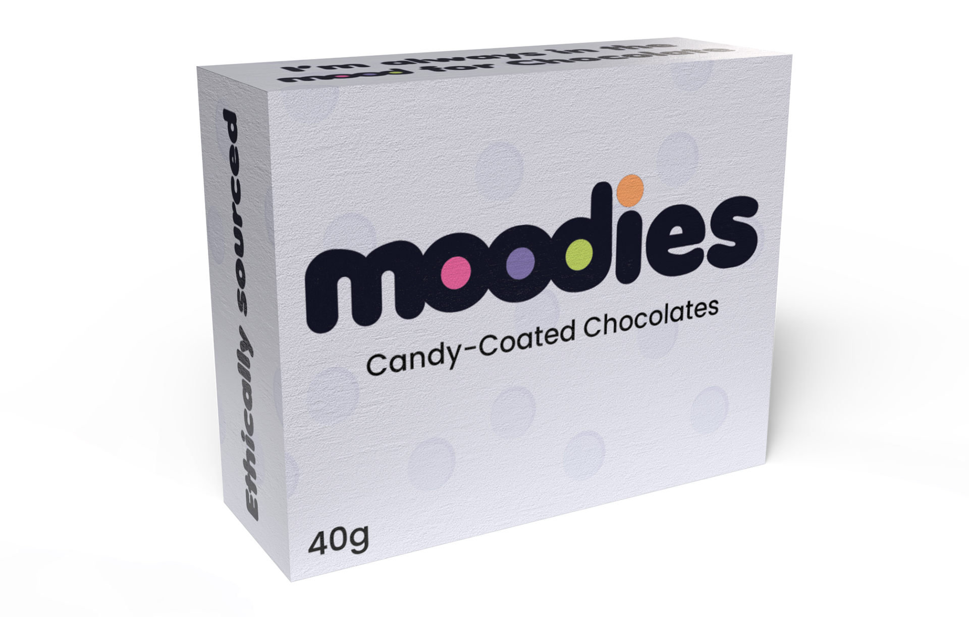
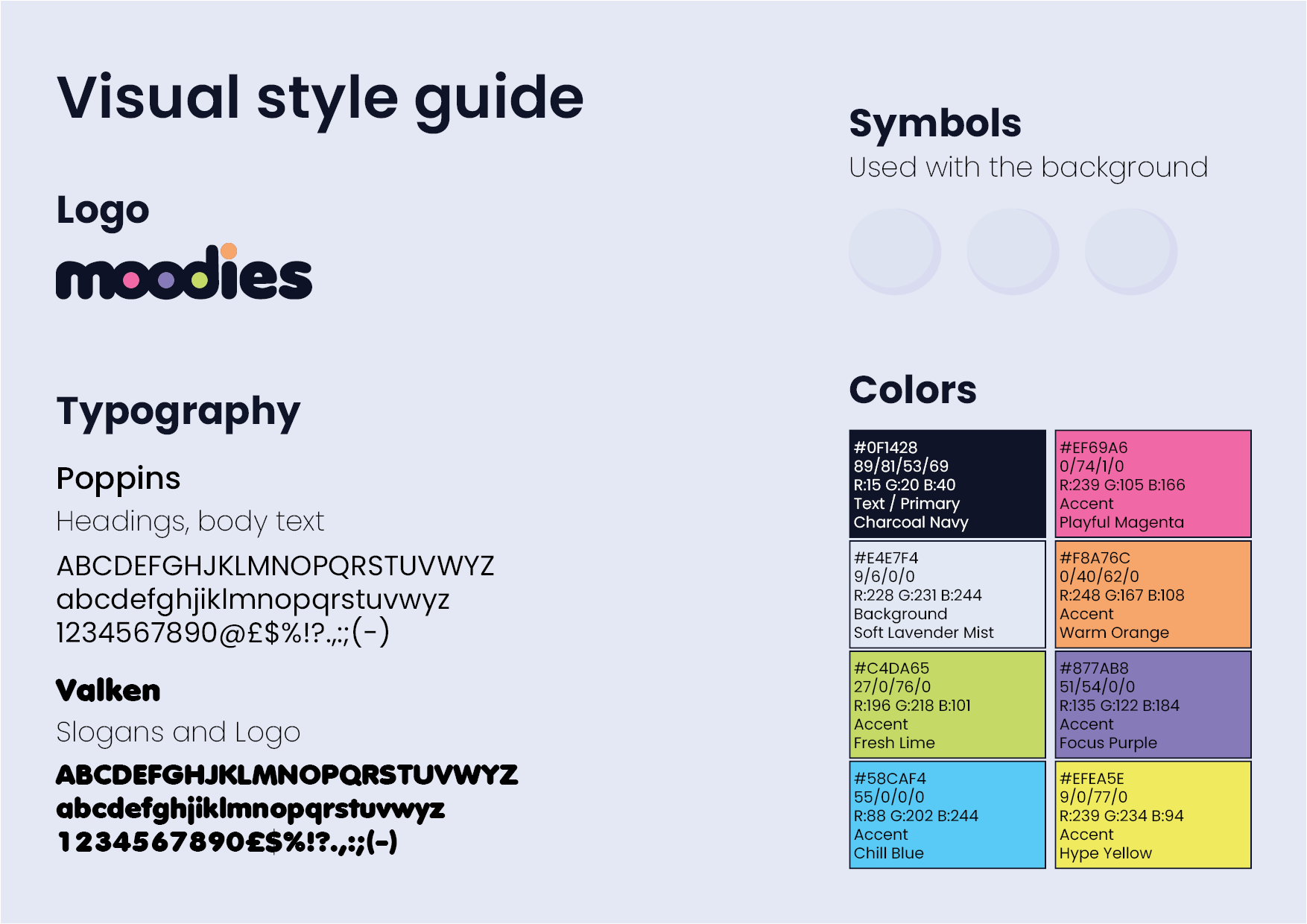
This assignment was part of the Graphic Design 3 module and focused on developing a complete visual brand system for a new candy-coated chocolate product aimed at a Gen Z audience in Europe. The brief was to create a product name, a custom letter-based logo, packaging for a 40g box, an informational A2 poster, and social media content that communicated both fun and ethical responsibility. I developed the brand Moodies, built around the idea that each candy colour represents a different mood, allowing the product to feel expressive, relatable, and playful without becoming childish. My design decisions were guided by research into Gen Z visual culture, retail environments, competitor packaging, and ethical storytelling. The custom wordmark uses rounded, soft letterforms to reflect the candy itself, with coloured “o” elements referencing the product and creating a strong visual anchor. A pastel colour palette was chosen to stand out against louder competitors while aligning with modern, design-conscious youth aesthetics. The packaging and poster designs prioritise clarity, simplicity, and transparency, presenting the ethical cocoa sourcing story in a friendly and accessible way. Across packaging, poster, and social media outputs, the goal was to create a cohesive identity that balances playfulness with credibility, resulting in a brand that feels modern, ethical, and emotionally engaging for teenagers and students.
Social Media Post
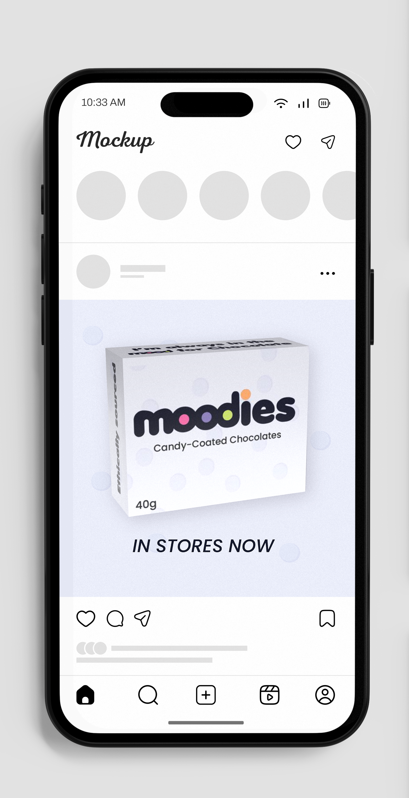
Social Media Post
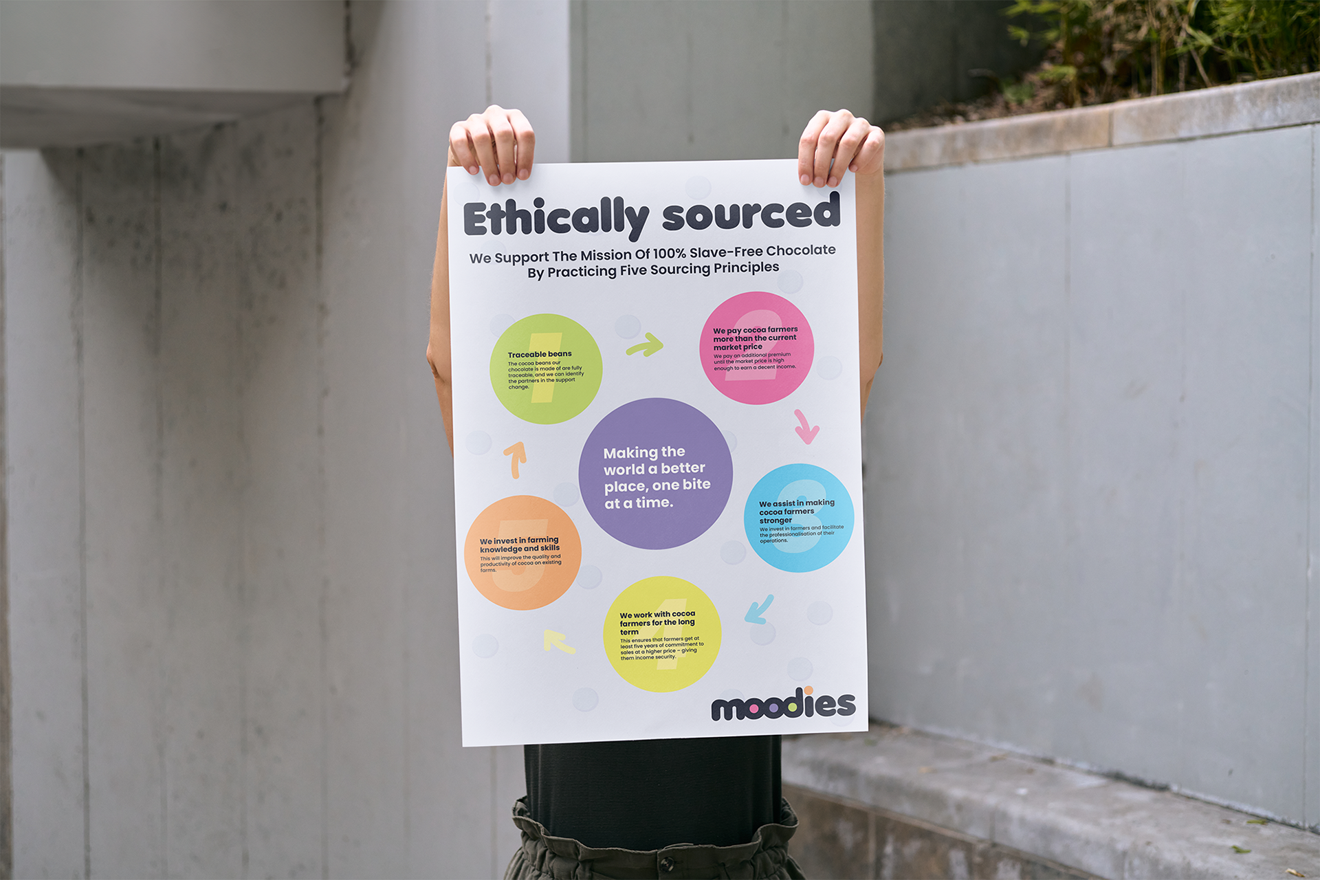
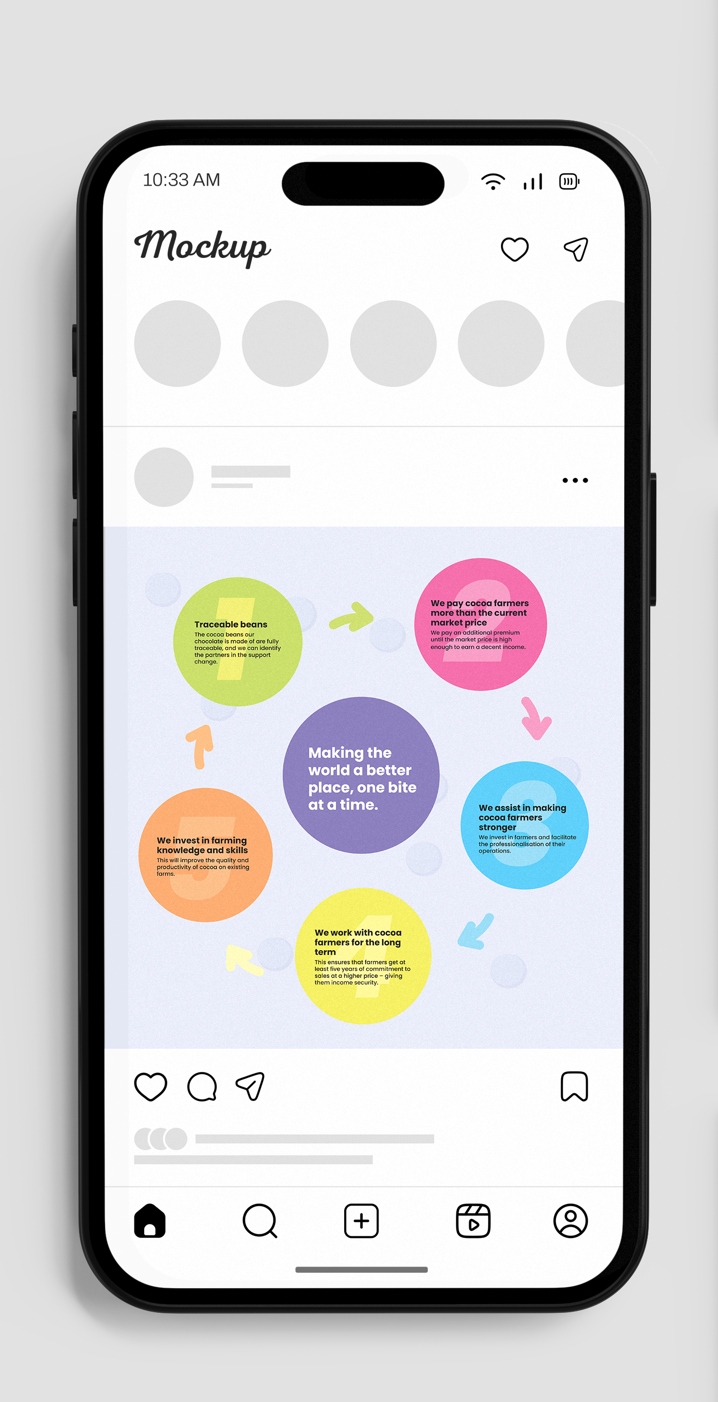
Informational Poster A2
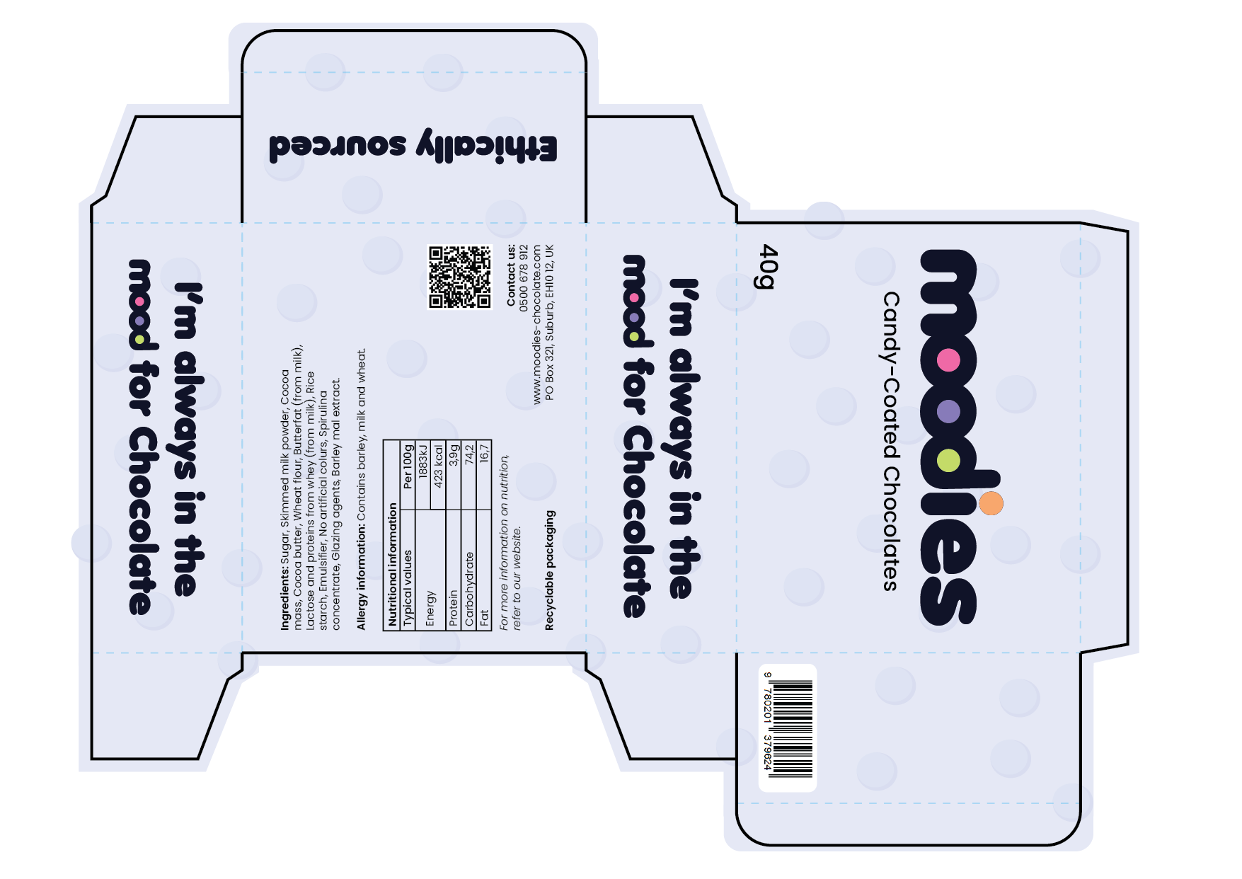
Packaging design with Dielines
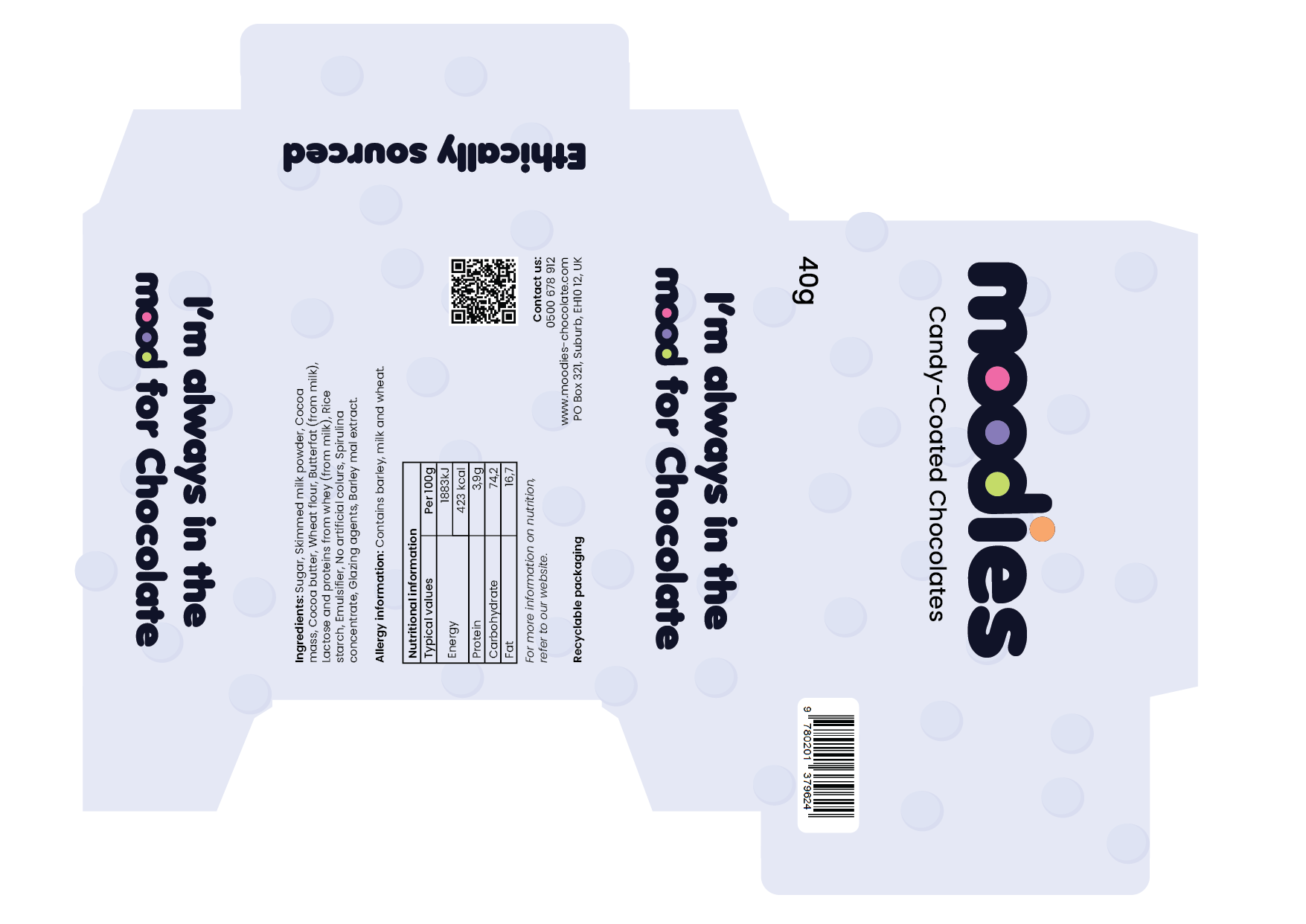
Packaging design without Dielines